Look here

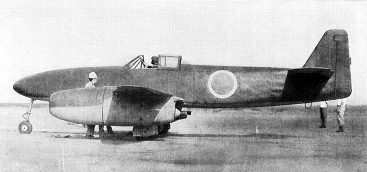
The Orange Type "O" paintscheme is OK, fairly plain and fresh.

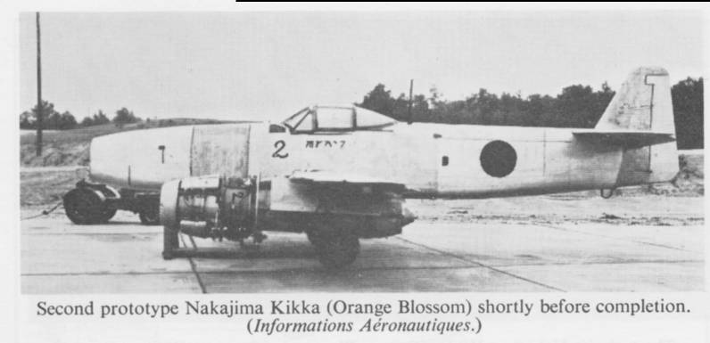
check the Markings, there's an inscription fairly easy to be read
for a Japanese.
The Blank engine nacelles need a bit imagination, as all pictures show them in
partially covered state. You can try slightly darker panels.
another thing to get it creamed up try sth to
recreate the rugged Blank, looks like far from polished.

Indeed if freshly under assembly you might can chose, but all pics of that certain
completed all Metal Kikka looks like a bit worn.
Google scratches or scribbles, nothing symetric, the more chaos, the better,
monochrome is best, lay it on top of the Metal layers, play with Layer settings
to get such a brushed like metal. Such blank kites if not coated used to get stained
after time, partially I would break the solidness, you can also try drips, or stains in slightly brighter
colour.
For wheathering purpose every grungy flix, coffee stains, hand drawn, Jackson Pollock
action or or Google picture is suitable to create a weaponry of Brushes that you can use for this.
Alternately search some PS Brushes, there's a variety already online, some free to use.
Specific can be easilly set up yourself, max. size of the Picture for Brush
is 1200x1200 Pixel

Experiment...
Your thoughts are right, the green can be easilly toned down, just reduce saturation,
a bit softer demarcation line can add a bit immersion. Just chose i.e. a Gauss Filter, softening.
A wheathering layer can help too. Just chose a grunge Texture of concrete or stone.
Google...
Lay it on top of the Paintscheme layer, then try different transparency or Layer settings, i.e. multiply or
whatever, you should find then a suiting setting that adds a bit rougher structures.
Hope this helps
Tobias
 Author
Topic: Questions about Kikkas (Read 1656 times)


