Hello again guys, so, I looked at the parts I had already done and there seemed larger gaps in places, like the fit was bad,
so, I spent a few hours going through those again but it seems that is how they were made. I had slightly altered things
a little because usually when we clone these things for the inside, we make them slightly smaller so they can fit inside of
the external body parts, anyway, it was more the way they were made so no dramas, but it took time to go through them
again and the same time I tinkered with those the pilot view was lowered and so that was out of the way.

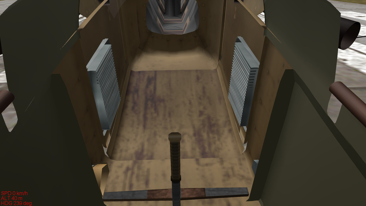
Here is what I mean about the fit, they look loose so to speak, you can see the gaps, not what I thought for an aircraft
even of that vintage:
I put everything back together, I had hidden things to see what I was doing and then turned to the instrument panel
after looking at the video Spider posted.
I tried a texture on the area but it would only show on one half so I decided rather than try and re-texture
what I had it was better to make something to add over the existing parts:
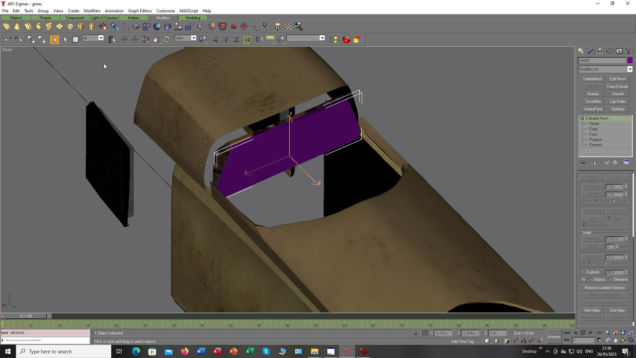
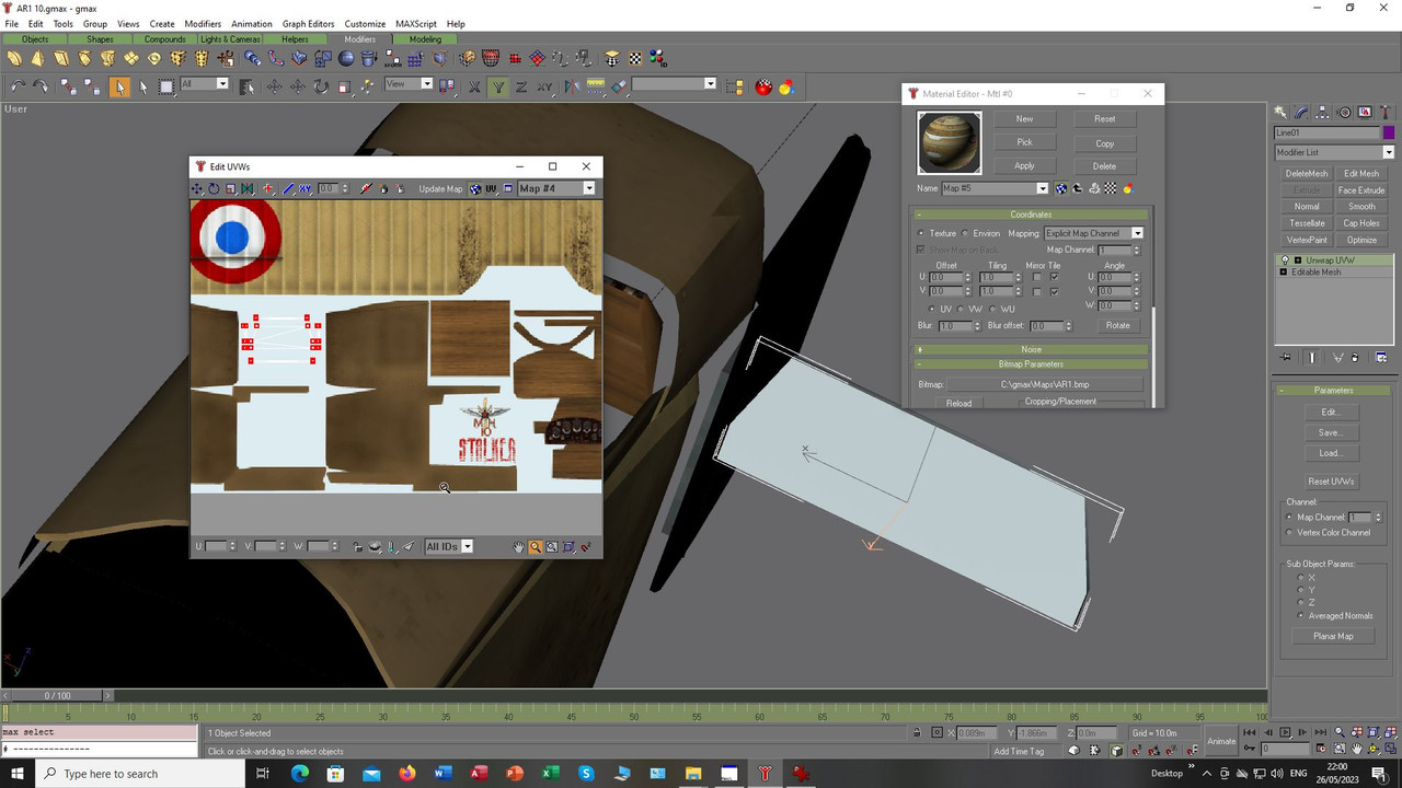
This was mapped to a spare area of the existing texture but looked really too small, however, it would
do for the external view I thought:
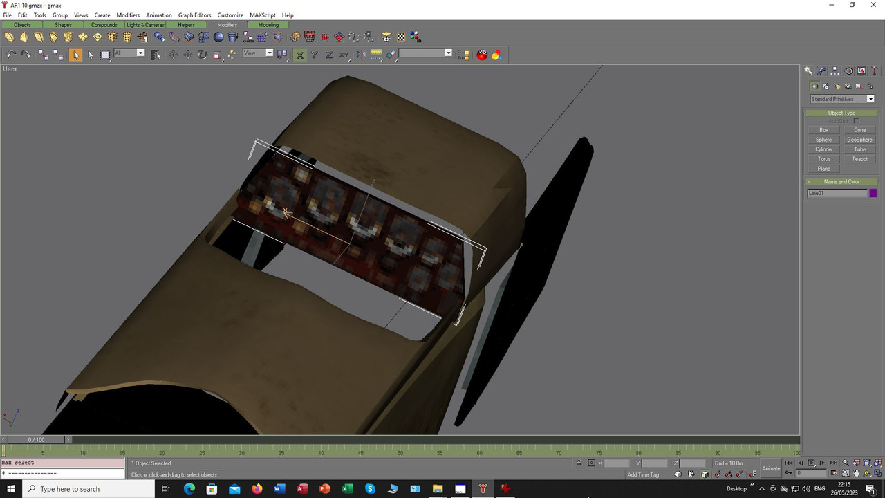
The texture was an image borrowed from the video, not meant specifically to be a permanent part of the
panel more to help me see how and where things would need to go, something to help placement if you will
but it did not look so good in gmax and even worse in sim when seen in the external view when added into
the aircraft:
I decided to make the texture larger so it would look better on the mesh, this meant it would need
a texture just for the panel so I made one, not brilliant as I had taken it from the video so aligning
it was difficult but I messed around in Photoshop and then mapped it to the mesh again, it looked
a little better and much clearer now:
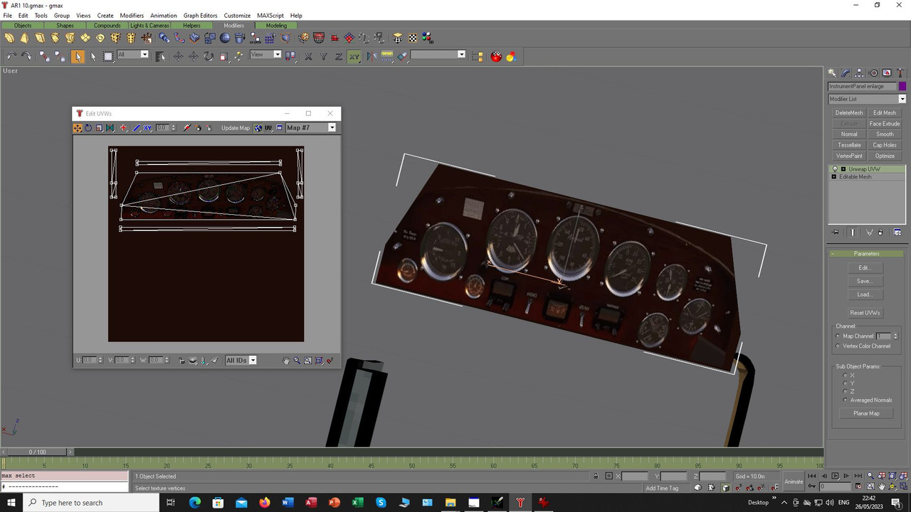
Sharpness is not really a problem as it is more meant to allow aligning of other sim textures already
available but it looks better than the bare wooden instrument face we have at the moment and so
I now have something to align parts to. Someone mentioned that the Breguet 14 might have a suitable
cockpit so I found some bits of that and they are what you see in the lower corner as a trial fit to see
how difficult it would be to adapt those to the AR-1, looks like there would not be much orientating to
do so that is good to know:
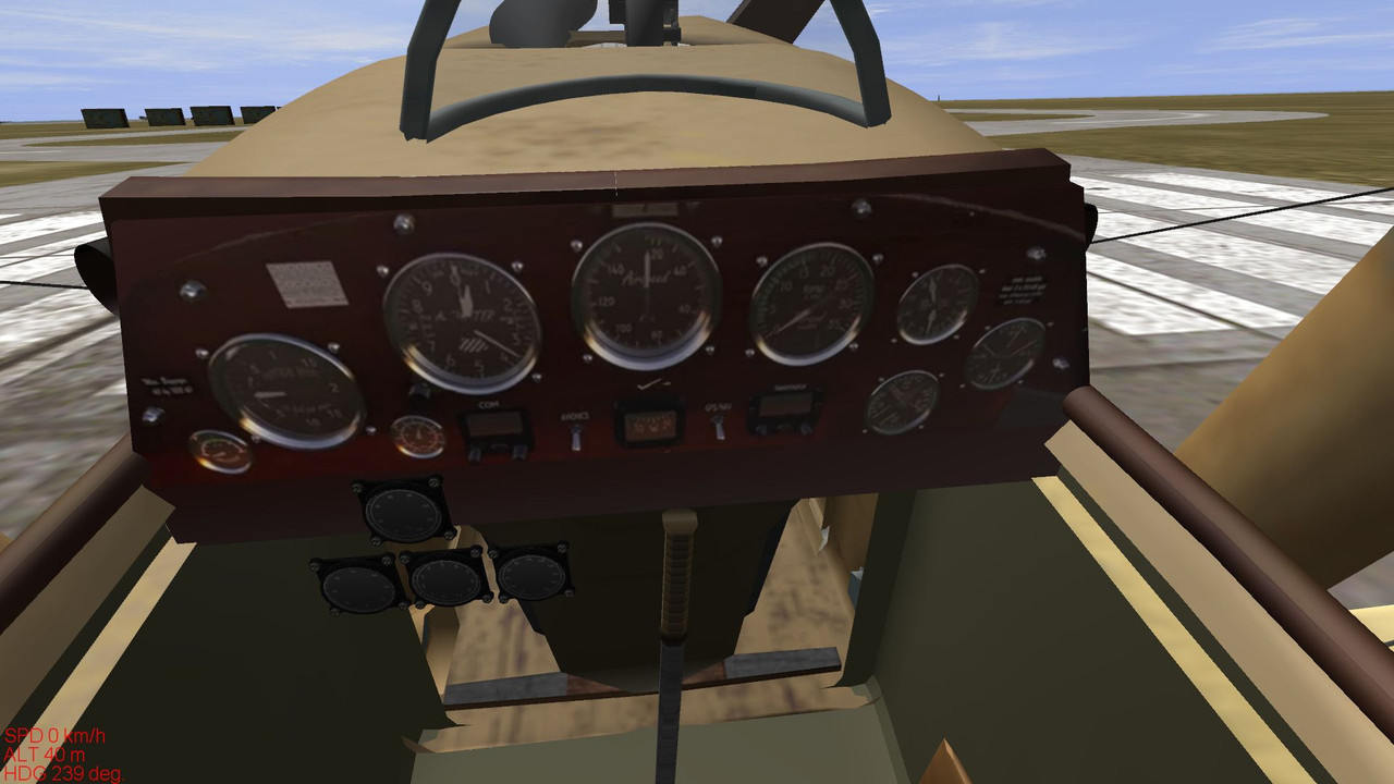
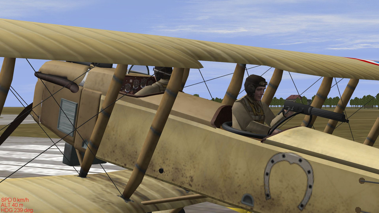
Here is the outside view:
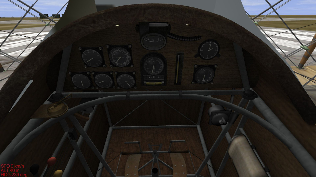
However, here is the Breguet cockpit, mine has an odd viewpoint for the pilot like there is another
cockpit in front but that can wait for another day. As you can see the layout is quite different to
that above from the Microsoft flight model:
Watching the AR-1 video there are certain switches and instruments that are part of a modern aircraft, I would
assume that this is specifically due to the fact that MSF is more a modern simulation of the flying world and so
represents technology we have now, not WWI, even old warbirds I think would have to comply with certain modern
regulations. However, is that panel in the video authentic other than that? I think I have to assume that the model
was based on a surviving aircraft so really the Breguet panel will not do so it looks like I will have to find another
source for the gauges and their pointers rather than try and split the Breguet parts up.
So, what next? Would you rather just have the Breguet cockpit in full instead of the AR-1 cockpit parts?
Should I try and get it as close to the texture I made as possible but using parts from our sim?
Decisions, decissions, where to go next?
Anyway, for the moment I will have to ponder that, in the interim while all this comes together and is a properly working
cockpit do you want a link with the changes that added the texture for the instrument panel so you have something
that looks at least looks a little better than the blank panel?
Take care and be safe.
Wishing you all the very best, Pete.

 Author
Topic: Cockpit WIP for Dorand AR-1 French biplane. (Read 4326 times)


